
CSS Responsive Video Embeds
The Gutenberg editor in WordPress is pretty great, but it does give the user a good bit of power to do things that we may not have anticipated when writing the CSS. One of these is video embeds. In the past, I have used fitvids.js. It works fine and while it is only 3 or 4 kb, it just feels like too much. Do I really need JavaScript for this?
The Problem
Do Nothing
Doing nothing is OK, but we do end up with a video that is not wide enough for the content area. This is a mild annoyance and more savvy users could adjust the embed code to take advantage of the available space.
Make it Wider
We could just add 100% width but then we end up with something like this. Notice the black bars on the sides. Again, not terrible, but certainly annoying.
Fortunately I found a way to accomplish this with just a few lines of CSS on css-tricks.
.wp-block-embed__wrapper {
position: relative;
padding-top: 56%;
height: 0;
}
.wp-block-embed__wrapper iframe {
position: absolute;
top: 0;
left: 0;
width: 100%;
height: 100%;
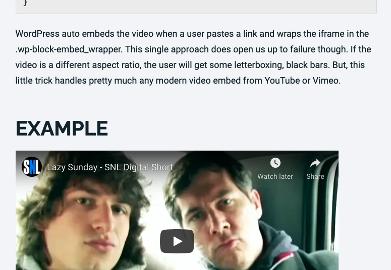
}WordPress auto embeds the video when a user pastes a link and wraps the iframe in the .wp-block-embed_wrapper. This single approach does open us up to failure though. If the video is a different aspect ratio, the user will get some letterboxing, black bars. But, this little trick handles pretty much any modern video embed from YouTube or Vimeo.
Example
While this works great for WordPress video embeds, it does not work for every situation. More complex situations will like require JavaScript to get things to behave.